I think if there's any upside to Tahoe, the grievances may push me into blogging for the first time ever, because I can't keep these to myself.
I actually feel sorry for Apple's developers because there's no way you ship software this bad and inconsistent unless you've been handed a terrible design spec from Dye's team.
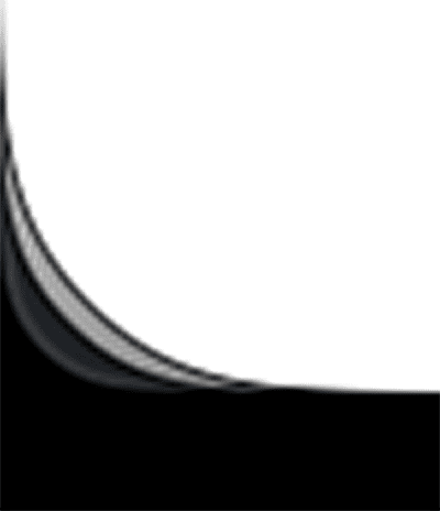
edit: On my screen, three layers' corners https://hcker.news/tahoe-corners.png
It's wrong though, because the window is the higher element in the hierarchy (container) and should not be affected by what is inside. It creates a larger inconsistency than the "consistency" it supposedly brings.
HOWEVER, due to the open nature of the platform, you can install an extension to clean this up. Now, all my windows have identical corner radii, strokes, shadows etc. My Linux desktop is, surprisingly, more consistent now than macOS in this regard.
https://extensions.gnome.org/extension/7048/rounded-window-c...
Hopeful they don't wait 7 years to change stance.
All this version alignment, the blurring of "here is a laptop with A processor and iOS" points to that direction.
The errs of Tahoe are basically a result of the rush on that direction
But macOS? Good lord. I can only hope 27 will unfuck things somewhat, there are so many small annoyances and all of them add to a constant sense of unhappiness throughout the day. I’m really tempted to downgrade back to Sequoia. At least the M4 will be good enough for years if this truly is the new path Apple will take.
I just did an image search for "classic macos" and one of the first hits was from https://www.versionmuseum.com/history-of/classic-mac-os. Look at those System 1 screenshots, from 42(!) years ago -- round corners on Puzzle and Calculator, square corners on Note Pad and Control Panel! No consistency at all, isn't it infuriating?
If you made it this far, know I am totally messing with you. It really is unnerving.
The author notices that adding a toolbar changes the radius, and to me it makes sense. If theres a toolbar, I know how much I can cut the corners, because the icons in the toolbar are not gonna be in far corner. At the same time, when I am unsure about what type of content might get cut by the corner, I will reduce the cut slightly to give that content more space.
I couldnt care less that one radius is not the same as another, I guess my OCD levels are not that high (yet?).
And I say all of this as someone who dislikes the glass design, and especially hates the small, slowly fading in volume/brightness indicators in the corner replacing the mid screen beautiful instant indicator.
I don't see the big deal. That seems like a reasonable design choice. Make nice rounded corners when content allows, but rectangle them up as needed?
Seems like a nice adaptive design choice.
Honestly making different apps slightly more visually identifiable in a sea of sameness doesn't seem like a big deal.